


At Fivetran, we believe that a business intelligence (BI) platform is an essential component of any modern data stack — and a key driver of data democratization across organizations. When you automate ELT, centralize your data in a columnar warehouse, and run a BI system on top, you’re laying the foundation of a data-driven culture. Now your analysts can rapidly create automated dashboards and reports that will incorporate data from every source, continuously sync to your warehouse, and empower both technical and non-technical users to interact with data and discover insights.
Top business intelligence tools
Fortunately, there are a lot of great BI offerings in the market these days. Top-tier platforms include:
Unfortunately, it’s not always easy to know which tool is right for your organization. They vary widely in terms of feature sets, capabilities and price. You can simplify the process by using the following eight criteria to evaluate prospective solutions. The right BI system for your organization is almost certainly out there, whether you’re focused on self-service capabilities, democratizing data organization-wide, creating vivid visualizations for individual departments, or standardizing critical reports — or all of the above.
Key considerations when choosing a BI tool
1) Cloud technology and integration with cloud data warehouses
Modern cloud data warehousing is elastic, fast and cheap, offering the possibility of a radically simplified business intelligence architecture for organizations of all sizes. A recent survey by Dresner Advisory Services found that 48% of companies consider cloud business intelligence to be either “critical” or “very important,” with current and future cloud BI deployment expected to grow substantially.
Over time, businesses will only increase their use of SaaS apps, and as they do, BI tools will need to live in the cloud as well. Cloud tools enable users to securely access and view data on the fly through desktop browsers, smartphones and other cloud-enabled devices. This enables broad information sharing and increases data-driven decision-making. Imagine, for example, a sales rep who looks up customer information on her phone before an off-site client meeting, or an exec who can share a performance metric with a board member on a late night call. Cloud technology enables self-service analytics anywhere, anytime.
Given these possibilities, any BI tool you choose should be cloud-based and capable of seamlessly connecting to major cloud data warehouses. Fortunately, many are. Tableau, for example, enables direct connection to 14 warehouses, including Snowflake, BigQuery, Redshift, Aurora and Azure. Sigma Computing also supports multiple warehouses, including BigQuery, Redshift, Snowflake and PostgreSQL. Mode Analytics lists 20 warehouses it can connect to within minutes. Sisense boasts that it supports cloud-native, high-performing data warehouses. Looker supports all major cloud warehouses, and provides documentation that explains how to connect to each one.
2) Ease of use & interface
Traditionally, BI tools have been run by IT specialists, who would deliver the results to the rest of the business. As organizations moved to democratize data, however, BI tools have increasingly focused on ease of use and self-service analytics. For many, the objective is to provide a single source of truth for every key decision-maker. Ideally, even non-technical users will be able to explore the data themselves, create their own dashboards and visualizations, and share reports with their team.
We describe the self-service offerings of several popular BI tools below. Note that ease of use is quite subjective and can’t be determined by objective benchmarks. The trick is determining what will work best for your users.
Chartio reigns as the easiest-to-use BI platform on peer-review site G2. One data services professional notes that because the tool is so easy for employees to navigate, he has more time to tackle higher-level tasks: “It’s easy enough business users can build charts and dashboards themselves. I can focus on data management and integration.”
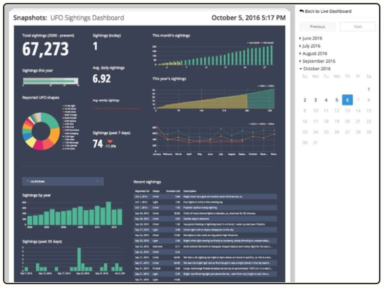
Shareable dashboard from Chartio
Sigma Computing offers an intuitive spreadsheet interface that will be familiar to users of Microsoft Excel and Google Sheets. Many reviewers on G2 found the UI quite easy to use, with drag-and-drop functionality for non-technical users and SQL tools for more technical users.
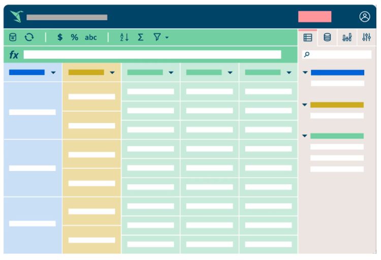
Sigma’s spreadsheet interface
Tableau offers interactive dashboards and allows users to create visualizations through drag-and-drop functionality. Users can build visualizations by adding fields from the data pane to the current view, which enables easy data exploration. One user on Gartner Peer Insights noted that this made Tableau “one of the best tools I have used when it comes to analyzing and presenting data.”
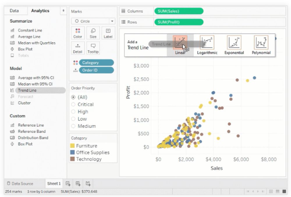
Tableau UI allowing users to drag and drop dimensions
Power BI enables ad-hoc exploration of data from several sources, and it’s effective when analysts are working with ill-defined requirements and need to explore the data without barriers. It works less well for business users who don’t have time to understand the data. Domo works well for teams looking to create more standardized reporting, but IT or analysts tend to author the data inside the dashboards, while business users consume it.
3) Automated reporting and notifications
Building automated reporting into a BI platform improves efficiency across the entire business. Specific reports (e.g., monthly sales figures) can be generated automatically whenever teams or key decision-makers need them — a VP of sales could have a revenue report emailed to her every Friday morning. Employees can set up automated emails or alerts triggered by events like a closed sale or critical mass of support requests. One-button refresh makes viewing results within a specific dashboard quick and easy. Automated reporting also establishes a single source of truth and makes it easy to share data with partners and customers.
Power BI provides subscriber capabilities enabling users to have dashboard and report snapshots delivered to their inbox at a regular cadence. Mode’s Slack integration likewise allows snapshots to be regularly sent to a team channel or individual. Looker allows users to schedule an email delivery of a user-defined dashboard, visualization or data set.
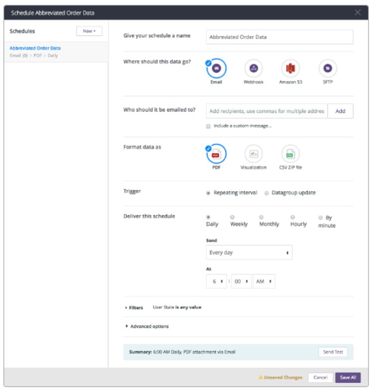
Scheduling email delivery of a dashboard in Looker
Several BI tools offer automated notifications when a particular metric reaches a predefined threshold. Sisense has a feature called Dynamic Pulse, which alerts you when you hit a KPI or your sales revenue dips below a dangerous level. Chartio offers a similar feature, and Looker has one as well. These can help maintain data integrity and security compliance. You can set up an alert triggered whenever new data in an unfamiliar format enters your system, for example, or when the system detects the wrong type of data in a table (say, type string data as opposed to type integer data).
4) Ability to import and export data
Centralizing data into your data warehouse with automated pipelines and analyzing it from that central repository is the best way to work with data in most use cases. However, it can be beneficial to export data into CSV files to allow analysts to make and share quick, ad-hoc calculations. Scratchwork doesn’t necessarily need to be saved long-term, but it should still be portable. Tableau allows users to export data to CSV files. You can export either a portion of the data from a data source or all the records; you can also export the data used to generate a specific view.
Importing data files into your BI tool may be useful as well. Adding temporary data to a project can open up opportunities to explore and test out ideas, without the commitment of storing it in a data warehouse. Power BI offers this functionality, even in the free version. Open the file, and Power BI Desktop will determine file attributes, which can be modified manually before you load the file into the tool.
5) Speed, performance and responsiveness
People expect rapid responses to business-critical questions, and the speed, performance and responsiveness of BI tools impact how quickly users get the insights they need. Querying data sets through caching, as opposed to direct querying, can increase speed and substantially improve responsiveness and performance. It’s important to consider available caching methods when choosing a BI tool. Here are a few examples.
Qlik offers QlikView caching, which stores selection states of queries and associated query results in memory, enabling querying from the cache instead of the source data. Sisense takes advantage of the CPU cache, performing calculations inside the CPU without having to copy data from RAM to CPU. Looker employs persistent derived tables (PDTs), which can shorten query time by pre-aggregating row-level data, such as sessionizing events, and creating fact tables up front. PDTs are derived tables written into a scratch schema on your database and regenerated on a schedule, speeding up queries and reducing database load.
6) Modeling layer with version control and development mode
As your analytics team grows, collaboration becomes significantly more complex. Having version control and development modes in the modeling layer supports collaboration at scale. Fortunately, BI tools commonly offer these capabilities via Git integration.
Looker, for example, offers Git integration for version control and collaboration. Users can save LookML projects, each containing multiple dashboards or views, to GitHub. Because LookML can also wrap around raw SQL, Looker can function as a collaborative, version-controlled transformation layer in its own right. Data professionals on G2 have generally been enthusiastic about the Looker modeling layer. One recent review said it made “data manipulation and field creation very straightforward and more natural than writing gross giant SQL queries by hand all the time.” Another praised its “version control through Git and ease of use for those without a coding background.”
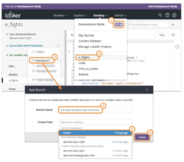
Creating a new Git branch in Looker
Mode Analytics and Periscope Data also offer Git integration. Mode allows users to connect to a GitHub repository of their choice, creating a two-way sync — changes made in Mode can be pushed to the GitHub repository, and vice versa. Periscope Data likewise offers bi-directional syncing for any Git repository.
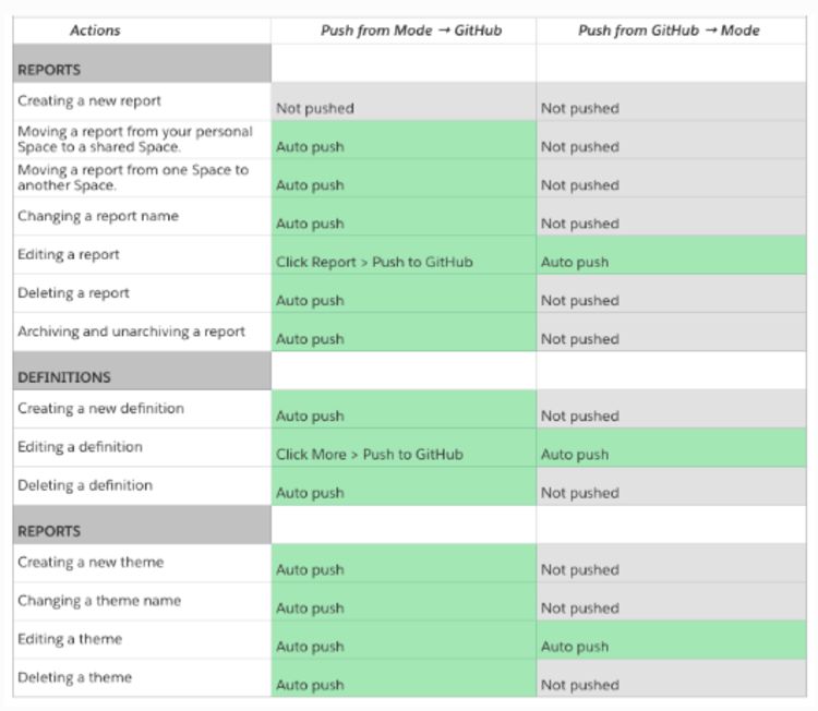
Merging changes via the Mode-GitHub integration
7) Visualization library & support for custom visualizations
When simple line graphs and bar charts can’t adequately convey rich information, users need more complex visualizations. They may also want to embed visualizations in external applications. Consider whether a prospective BI platform offers a wide range of native visualizations, whether it allows you to build or import custom visualizations using JavaScript or another language, and whether it supports embedded visualizations in external apps. Here’s a look at how a few BI tools handle visualizations.
In Power BI, analysts can use JavaScript libraries, including D3, jQuery and R-language wrappers, to create custom visualizations. G2 reviewers found visualizations in Power BI to be “rich and feature-packed” and appreciated their “range of connectivity options, DAX to get creative with, and … stack of custom visualizations.” It’s worth nothing that Power BI has a high level of interoperability with other Microsoft products, so its dashboards readily show up in other Microsoft environments.

Visualizations in Power BI
Looker offers custom visualizations, as does Tableau, and both platforms allow analysts to embed dashboards within Salesforce web pages. A reviewer on Gartner Peer Insights found Tableau dashboards “rich, varied and heavily customizable,” as well as easy to share; he also appreciated the security provided by custom permissions.
Visualizations in Tableau
A final consideration: BI tools should allow you to save and reuse individual data elements, such as calculated fields, all the way up to entire views or dashboards in the form of templates. Tableau users can achieve this by creating a template of calculated fields.
8) Price
After evaluating the different features of BI tools and their importance to your business, you’ll need to consider cost. Public-facing websites don’t always provide pricing information, and quite a few platforms require you to request a quote. Sigma, for example, offers a free trial and demo but no pricing information. The Sisense pricing page requires users to fill out a form including project type, number of users, data volume and project timeline in order to get a price quote. For many BI tools, price will depend on the number of users and scale of deployment.
Power BI, on the other hand, spells out its costs clearly. Power BI Pro costs as little as $9.99 per user per month, but Power BI Premium jumps to $4,995 per month. Premium is recommended for enterprise-level BI. Tableau’s pricing structure is broken down by type of user. For individuals, it’s $70 per month, but that figure falls as you add users — to $35 per user for five or more users and $12 per user for 100 or more users. Chartio pricing and features are transparent at the Startup level ($40 per user per month) and Growth level ($60 per user per month), but Premium-level pricing requires a quote. Ultimately, the price will depend on the size of your organization and your particular use case.
Real-world use cases
Evaluate prospective BI tools using the criteria we’ve discussed above, and your search should get a whole lot easier and more efficient. If you’d like additional information on how modern businesses are leveraging BI tools, take a look at our case studies. Fivetran customers use a wide array of BI tools in their data stacks, including most of the platforms discussed here. At the top of each case study, we list out the components of the customer data stack, including the BI tool. We hope you find them helpful, and good luck democratizing your data!
To learn how automated data replication can maximize the value of your BI tool, contact sales@fivetran.com or try any of our data connectors for free.


